Art Direction | Brand System | Campaign Development
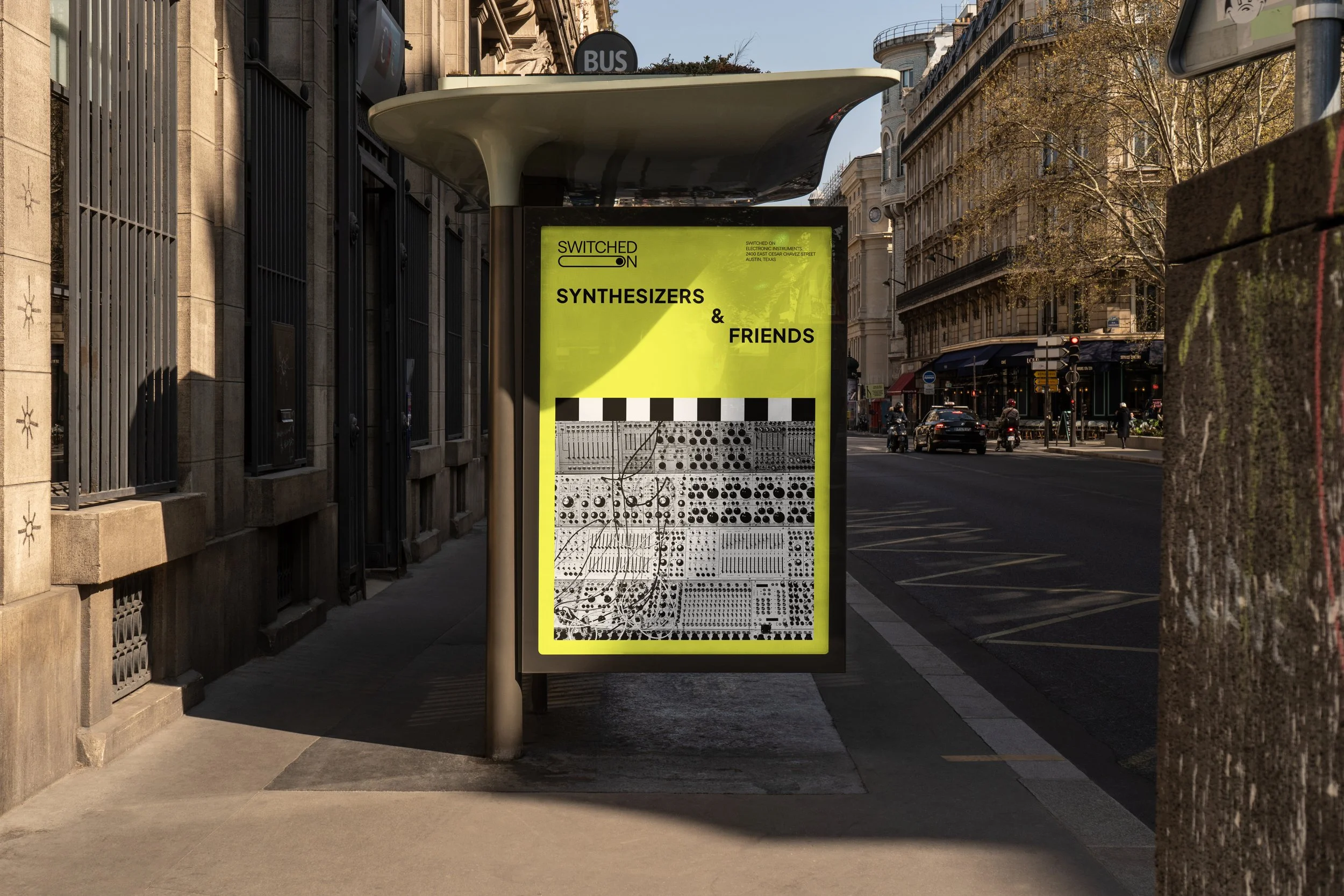
Switched On is a hybrid music instrument retailer, event space, and educational hub in Austin’s electronic music community. The challenge was to build a unified brand identity that could hold together retail, live events, and learning — without feeling corporate or losing its underground credibility.
Creative Direction
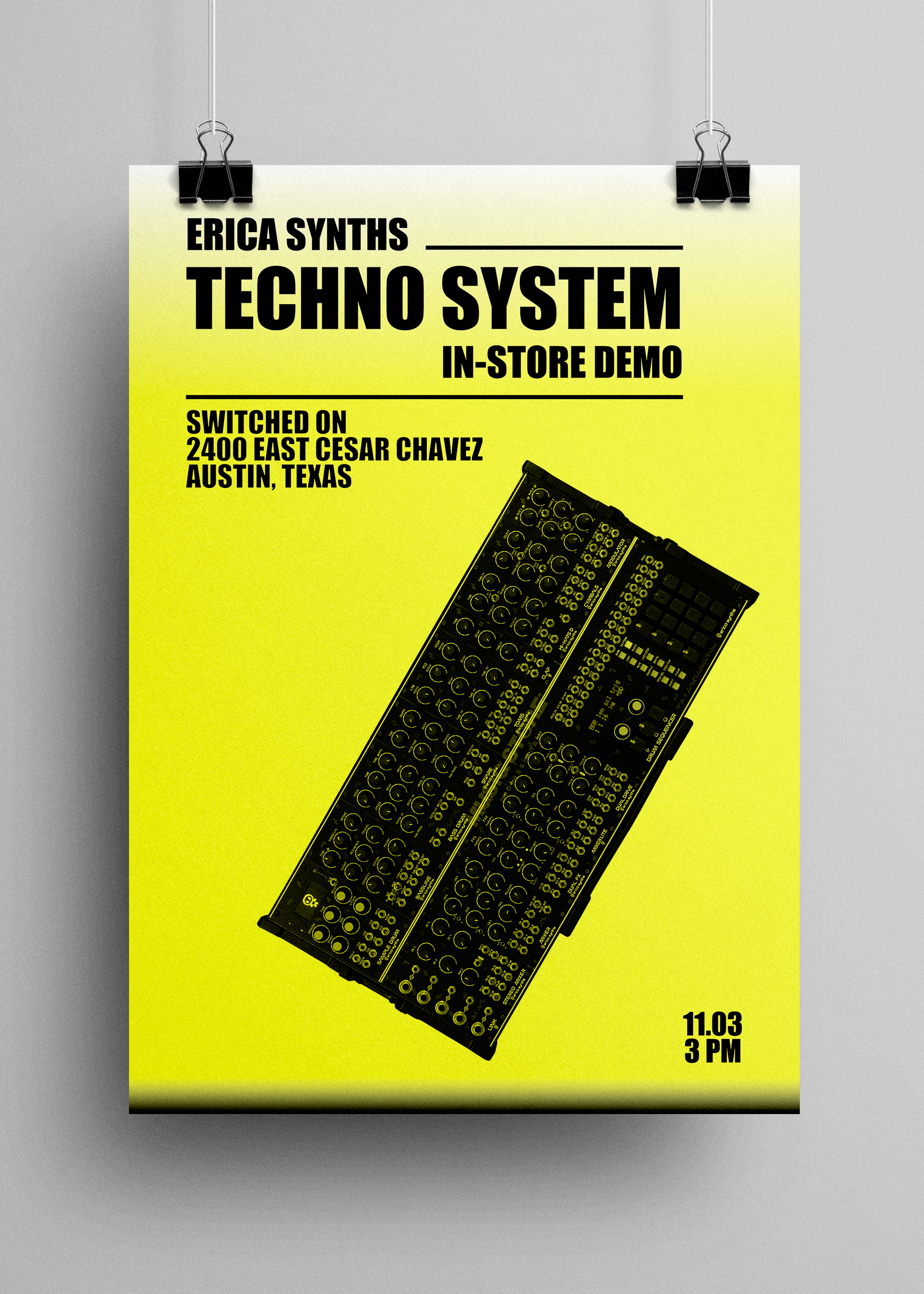
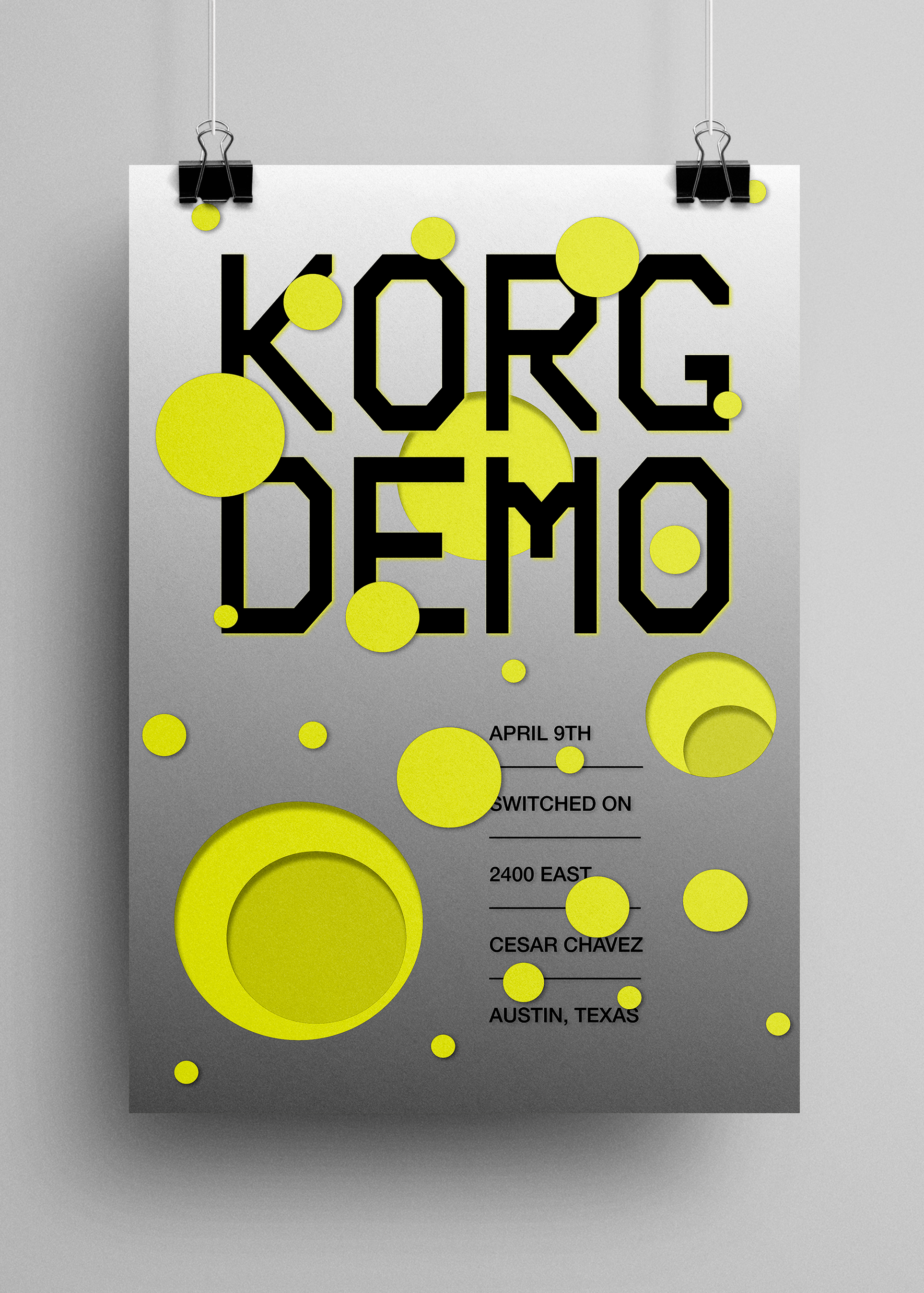
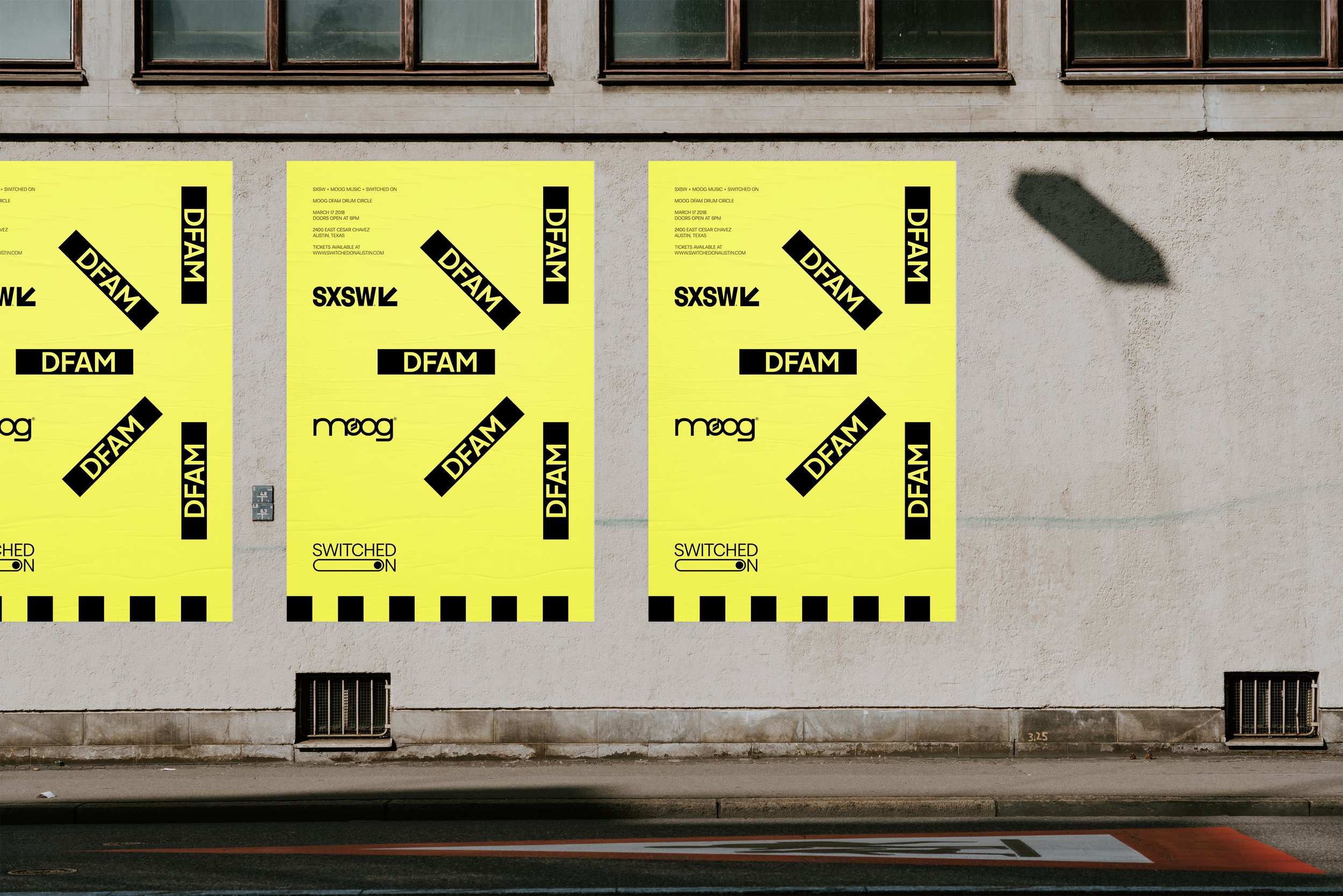
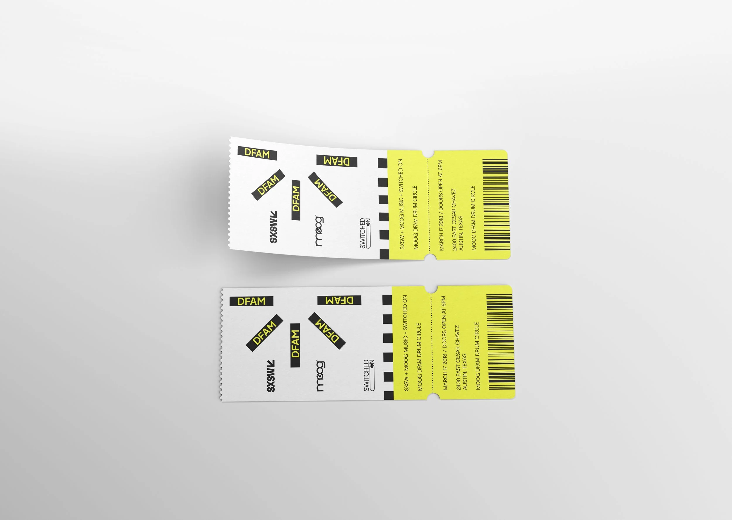
The goal was to position Switched On not just as a store, but as a cultural space where experimentation and community intersect. Rather than leaning into retro synth nostalgia, the direction focused on clarity, modularity, and visual rhythm — reflecting both electronic systems and creative play.
My Role
As Art Director, I led the visual strategy and system development, defining:
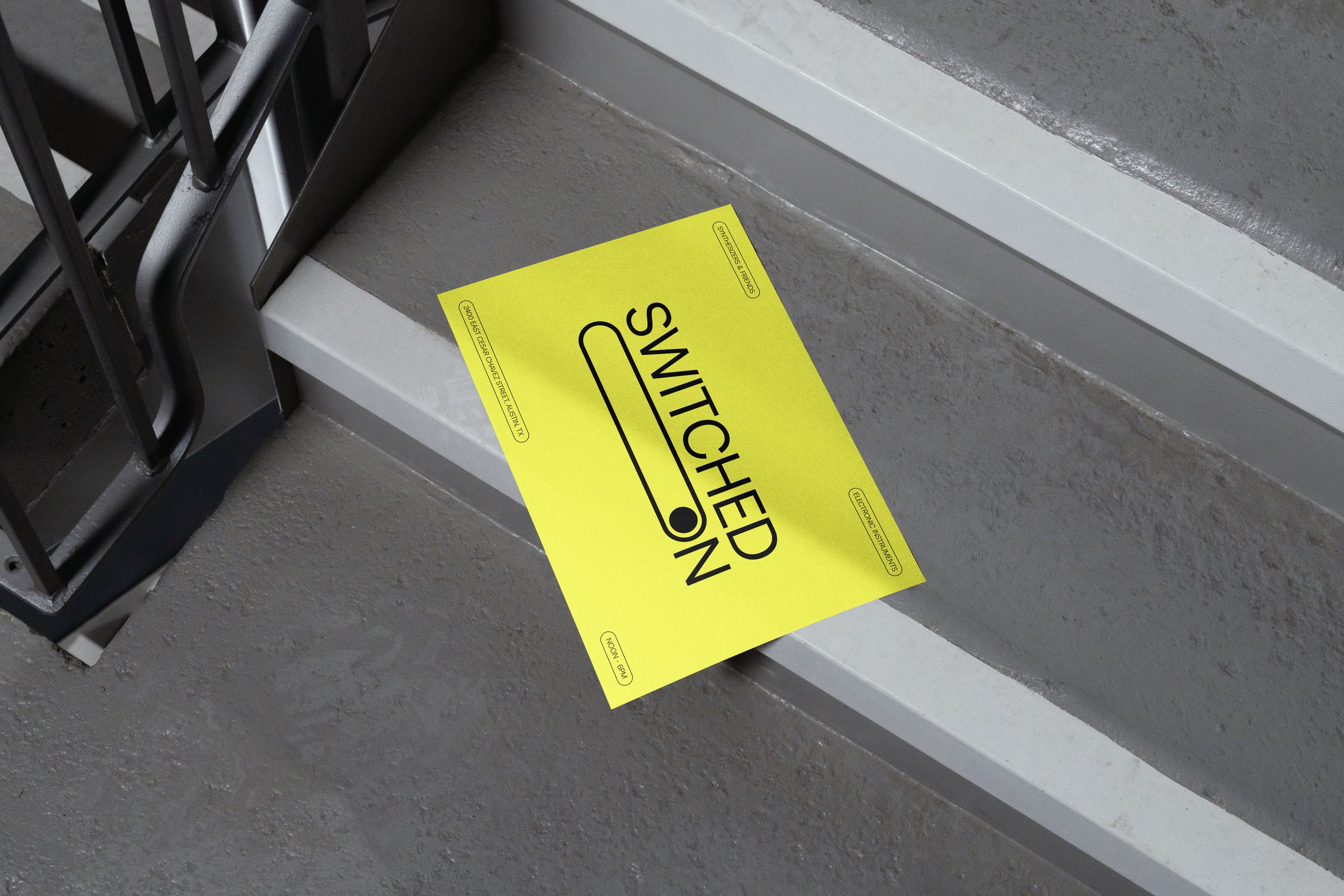
The brand’s visual language and graphic framework
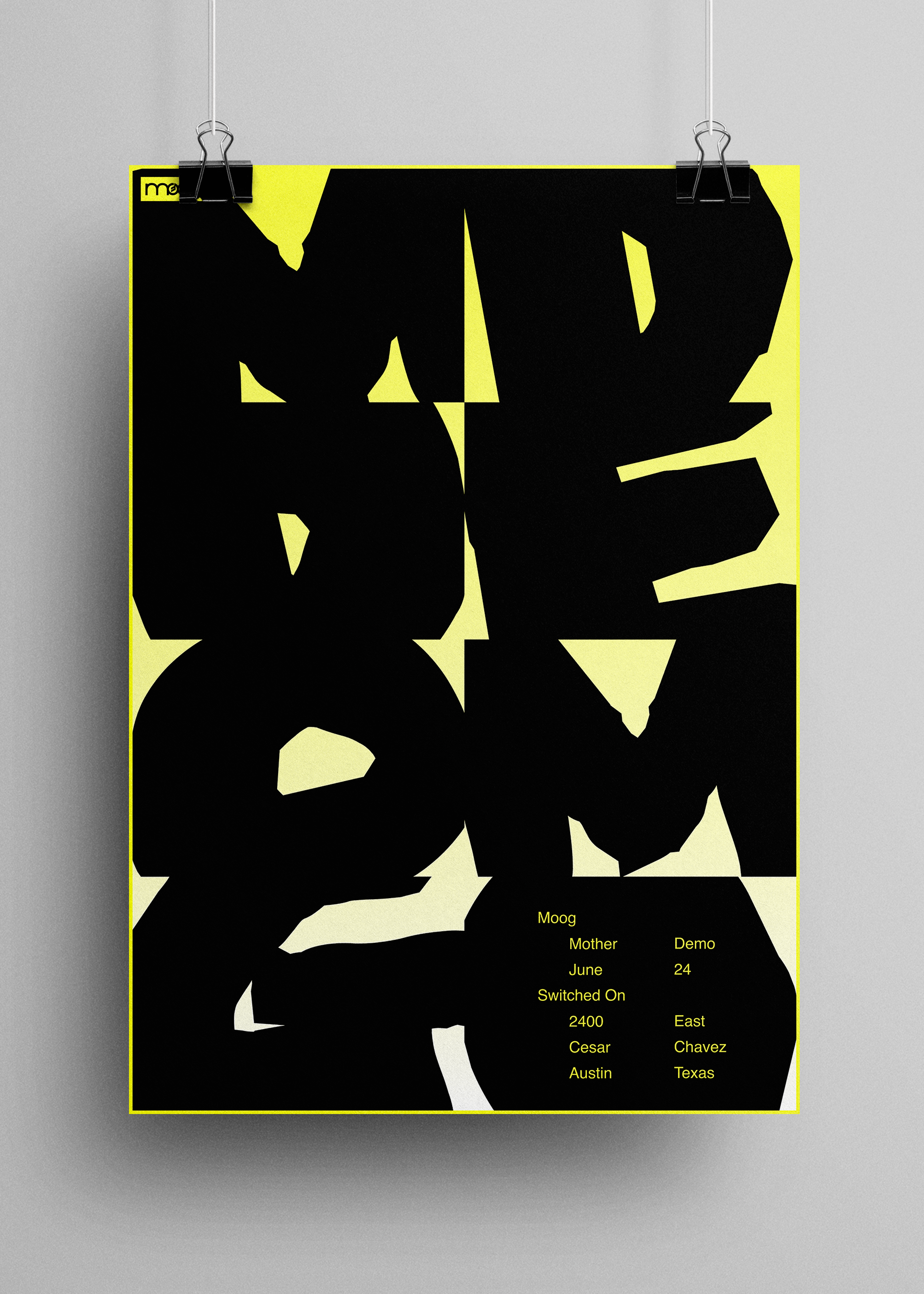
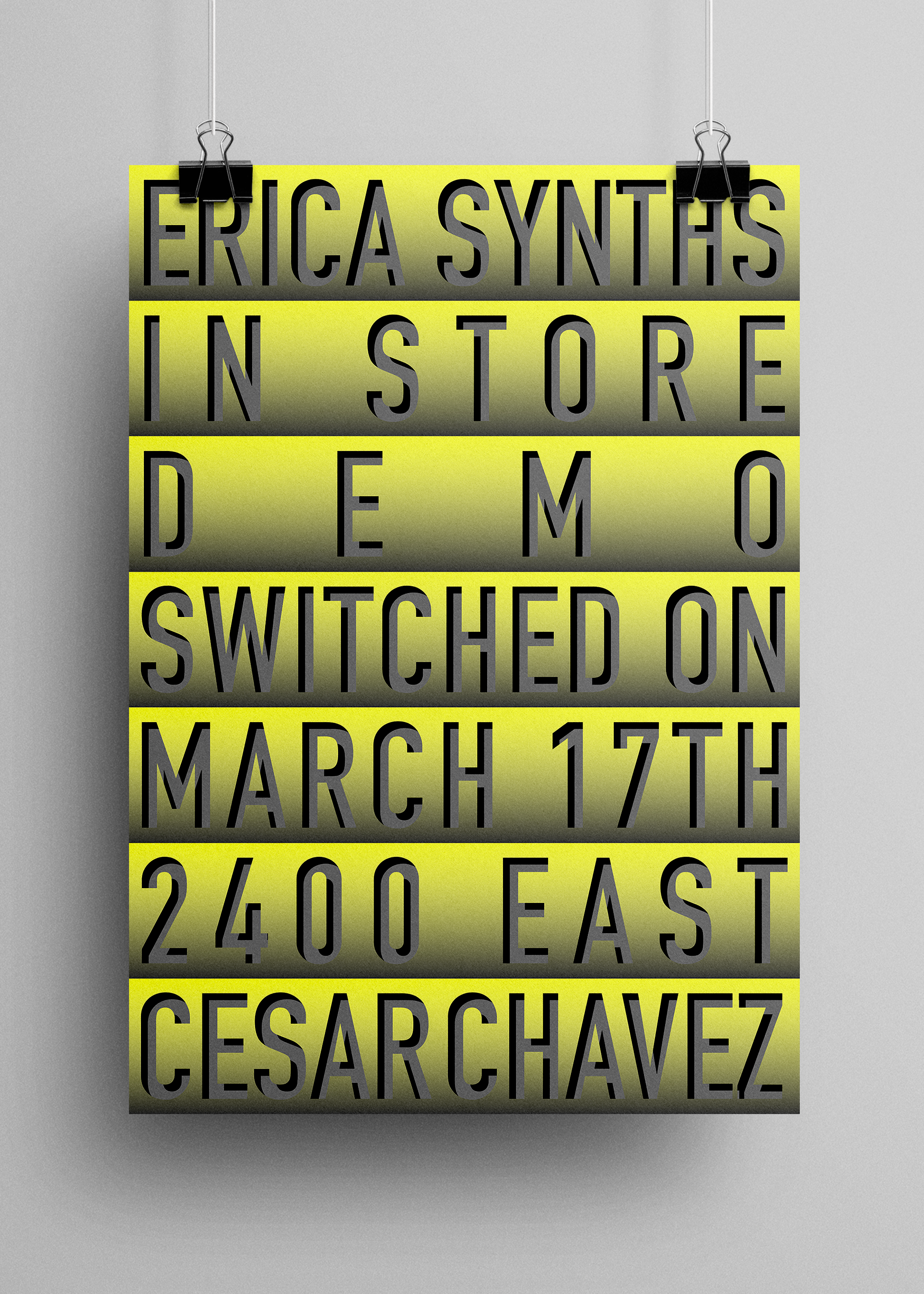
Art direction for photography and campaign imagery
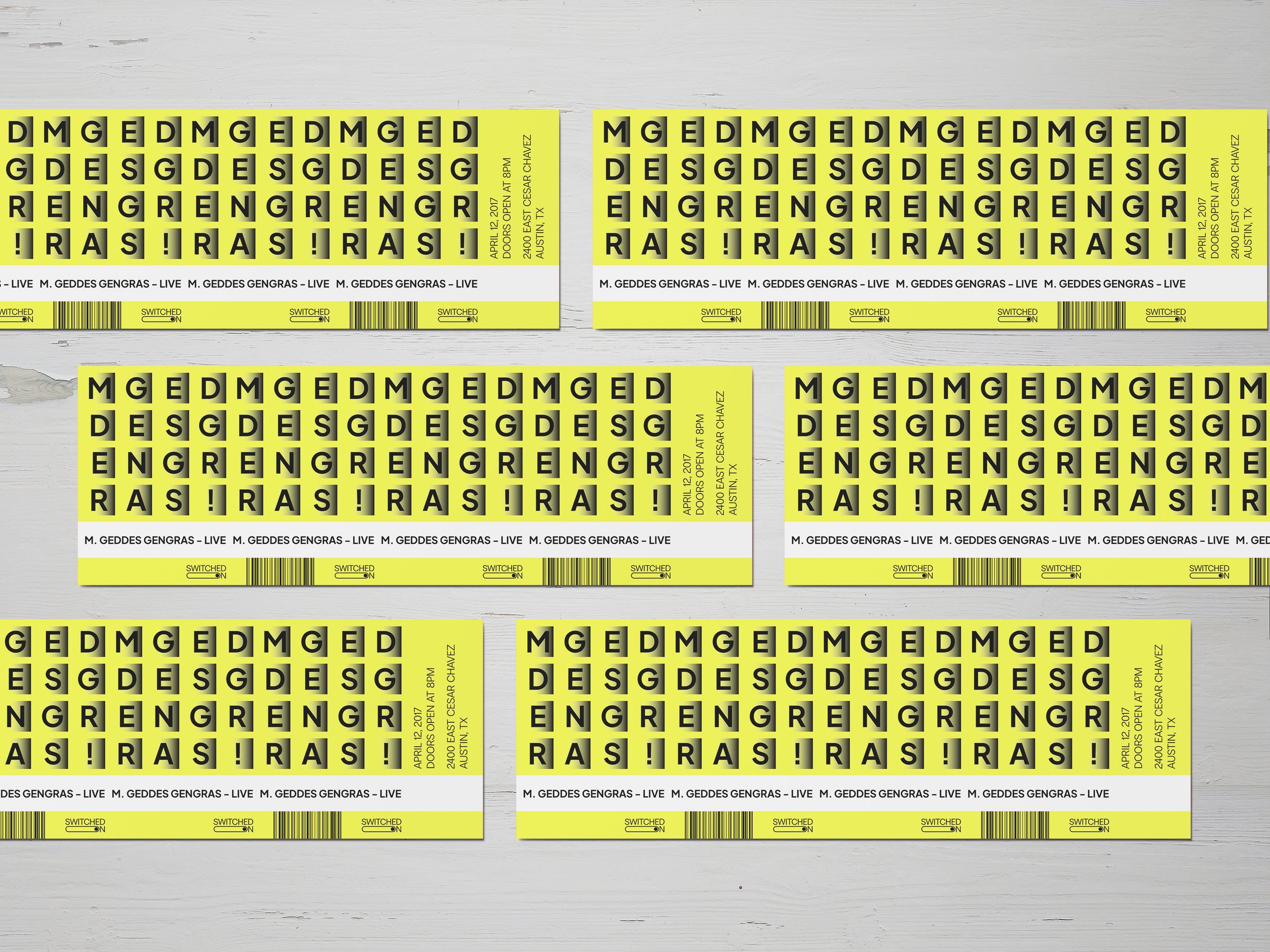
A modular design system that flexes across retail, events, and education
Tone and visual hierarchy across digital and physical touchpoints
Key Decisions
System over style: A flexible grid-based framework allowed the brand to scale without losing character.
Precision + warmth: Clean typographic structures were balanced with human-centered imagery to avoid a cold tech aesthetic.
Cultural positioning: Visual restraint helped the brand feel credible to professionals while remaining welcoming to beginners.
Outcome
The result was a cohesive brand system that unified Switched On’s retail, event, and educational arms, strengthening its identity as both a commercial space and a creative community hub.
Switched On